
02.03.25
Building Cards
How can we create card components that designers can easily configure while maintaining auto layout?
Overview
Background
Card component that contains a combination of content like text, images, buttons or icons. How can we make card components that designers can update the content while having built in auto layout.
Problem
- Multiple card header and footer types create inconsistency in usage
- Takes too long to build from scratch
- Component must be detached
Goal
- Uses auto layout to allow card component and it’s content to fit to desired screen sizes
- Can be configured easily by designers without having to rebuild from scratch
- Create a component that utilizes nested instances
Component structure
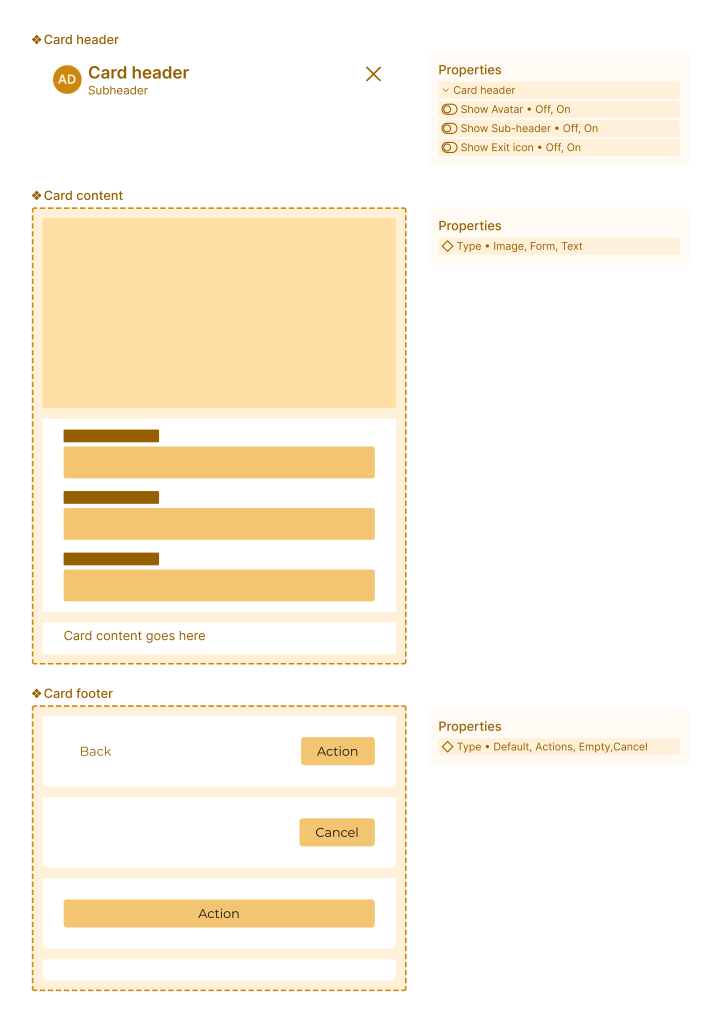
Atomic components structure
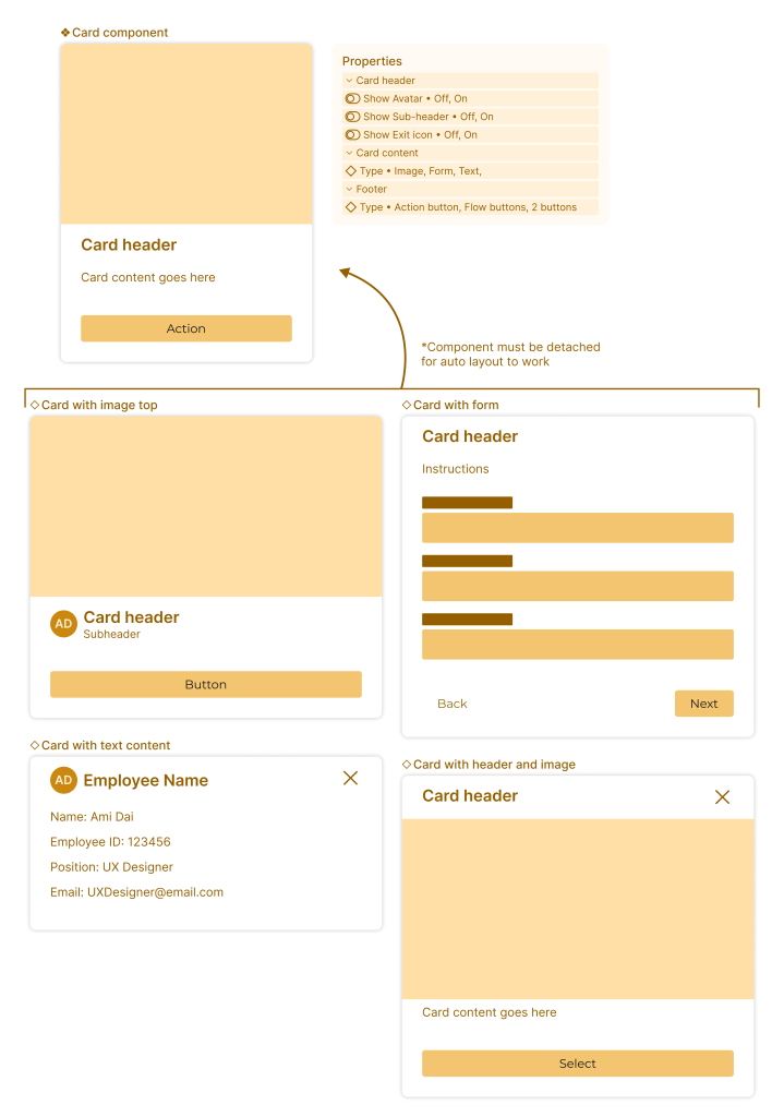
One component, multiple builds
By building this component this way, you are able configure different card types quickly and efficiently.
- Auto layout allows card content to automatically stretch to fit any screen size or container for building forms
- Adding in a toggle options allows users to quickly decide if they need certain UI elements such as card header avatar or sub header text
- Including type and state options allows users to seamlessly change options without needing to build from scratch and adjusting auto layout
- Although this component has to be detached at the parent level, nested instances allows the component to still utilized atomic component properties to switch out card content types to quickly access different pre built templates
 amy dai