
01.10.25
Building Field inputs
How can we create a single, easy-to-use component that is both flexible and configurable?
Overview
Background
Field inputs are one of the most used components in the design system. How can we create an easy to use component that is flexible and configurable into a single component?
Problem
- No single, flexible input component existed in the design system
- Designers were duplicating or detaching fields to customize them
- Layouts were breaking when content like helper text or icons was added
- Difficult to maintain or update styling system-wide
Goal
- Supports multiple field types (text, email, date, phone number, etc.)
- Includes built-in states (default, hover, focus, error, disabled)
- Uses Auto Layout to remain responsive and adaptable
- Can be configured easily by designers without detaching instances
Component Structure
Atomic parts make up the main component
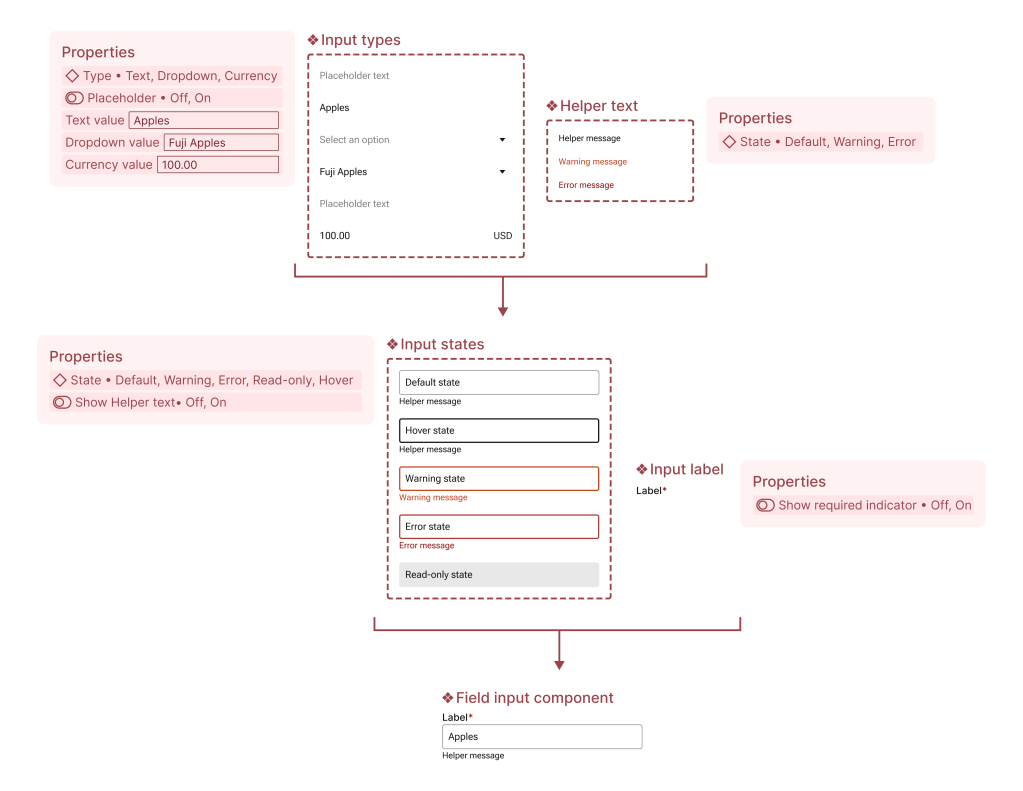
One component, multiple outcomes
By using Figma variants, you can build table components from the ground up—starting at the smallest units like cells. This keeps the main component clean and easy to use as well as easy to update and maintain.
- Auto layout allows tables to automatically stretch to fit any screen size or container for building forms
- Adding in a toggle options allows users to quickly decide if they need helper text or required indicator as they would in product
- Including type and state options allows users to seamlessly change options without needing to drop in a new component
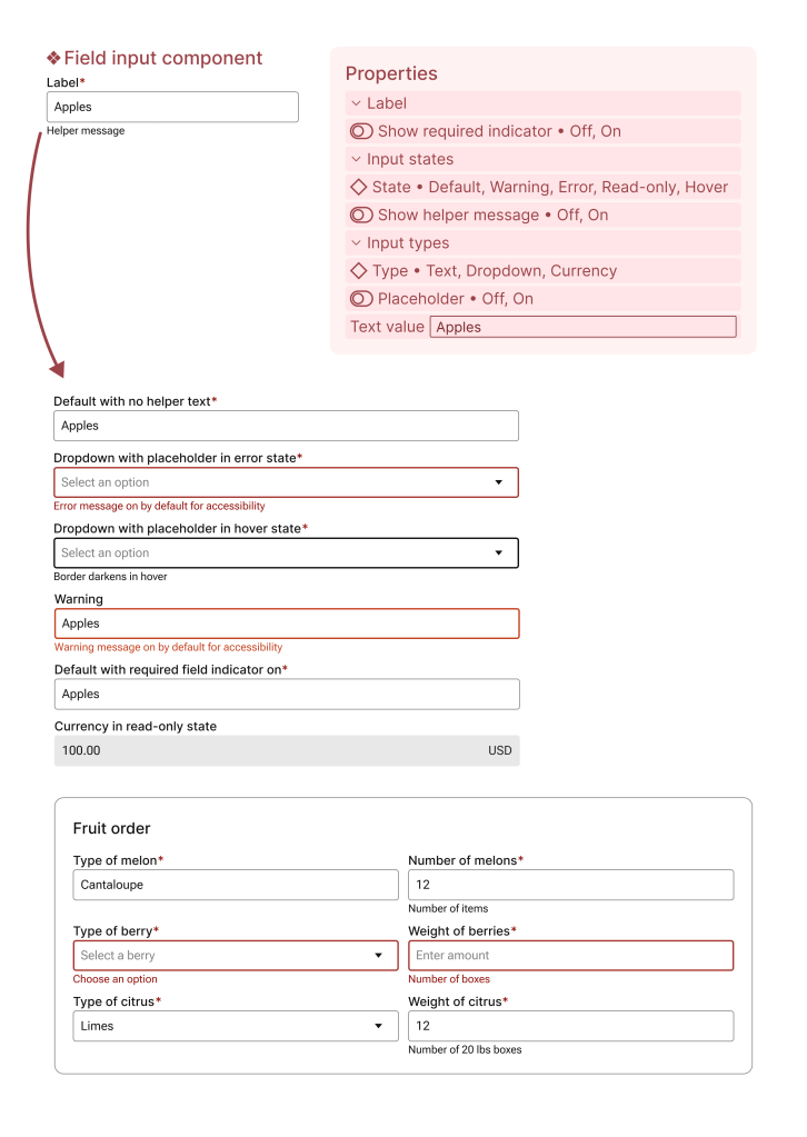
 amy dai