
06.11.25
Interactive Figma Library
Unifying product experiences with a modular, reusable design system at scale
Overview
As our teams scaled, we began to encounter growing challenges around consistency, efficiency, and collaboration. To address these issues, we utilized design systems in Figma to provide a centralized set of reusable components, styles and patterns that bring consistency and scalability to our product design team. Pega’s design system in Figma is not like others, they provide a wide range of complex components based off of their prescribed design system.
Problem statement
Before implementing a centralized design system in Figma, the product teams encountered the following issues:
- Duplicate work, with multiple designers recreating similar design files due to the lack of a structured system for file organization
- No clear naming standards, usage guidelines, or governance for components
- A disconnect between what was designed and what was built in code
- Lack of a quick and easy-to-access resource for exploring components, generating mockups, and supporting fast prototyping
Goal
Implementing a modular and token-driven design system to bring design consistency, streamline collaboration, and accelerate product development across multiple teams at Pegasystems.
Process
Component Audit
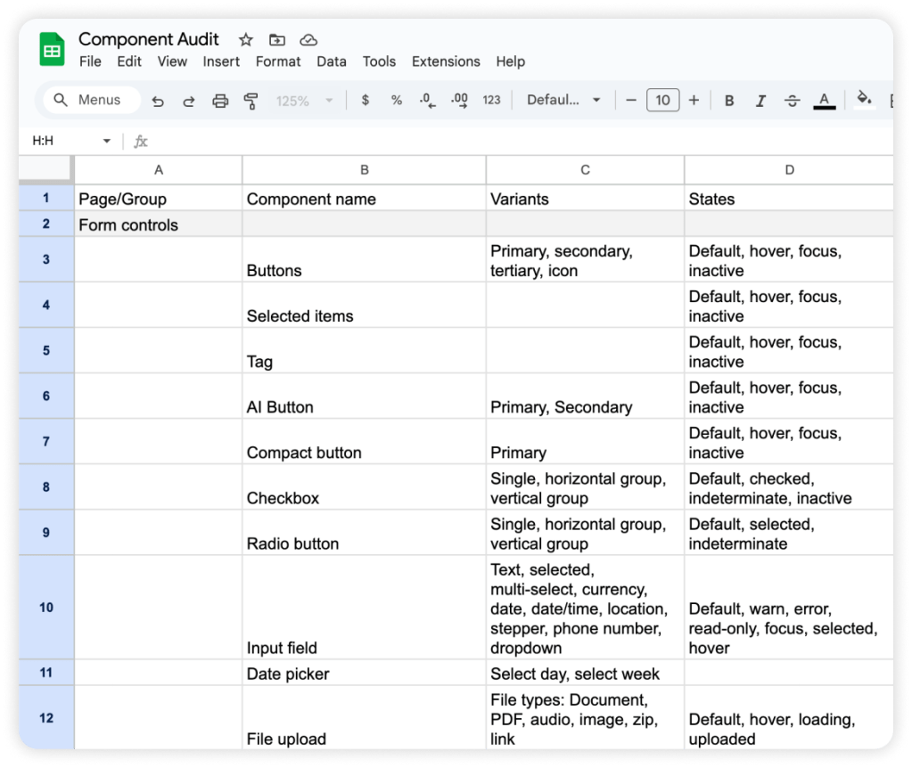
A component audit was conducted to provide a clear overview of the library. Components were compiled using existing resources such as Storybook and documentation. This exercise revealed foundational atomic components to build upon. By cataloging and grouping assets according to atomic design principles — from individual buttons (atoms) to complete layouts (organisms) — the process uncovered redundancies, inconsistencies, and opportunities for consolidation.
Figma Variables & Tokens
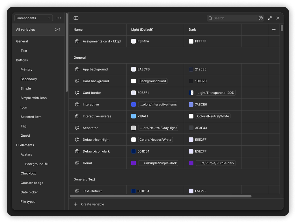
Figma Variables let you define reusable values like colors, spacing, and text to maintain consistency, enable theming (like light/dark mode), and streamline updates across designs. They help align design with code by functioning like design tokens directly within Figma. Once they were released we immediately took advantage of this feature to help provide our external clients a seamless and easy way to apply themes.
Structuring components
The main guideline for structuring components balances what Figma can support with how accurately the components reflect our product’s functions and features. This balance guided decisions on component properties, auto-layout behavior, and recognizing themeable tokens. Responsive behavior was built in from the start, making components flexible and enabling users to create mockups quickly.
Naming and organization
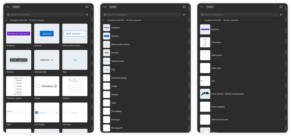
A clear naming system simplifies understanding the complex atomic structure of components and helps designers quickly navigate to specific parts, like atomic components or text containers, improving efficiency in Figma. Components are organized within the file to best reflect how our product is understood. Naming and organization are key to a library’s usability and success. In Figma, components can be found through search, within parent-child folders, or using applied aliases.
Feedback and testing
Accessibility
Since the color palette and typography were inherited, it’s important to follow established usage rules and patterns. Adding small callouts to highlight accessibility helps others understand the design system, ultimately supporting broader design goals.
Usability
It’s important for the design system to be usable by a variety of audiences. Usability comes from clear component naming, exposing the right nested properties, and ensuring auto layout behaves as expected. Considering how different teams use the system helps shape how components are built—for example, adding interactions to buttons can support teams focused on prototyping. Clear documentation also helps users understand how components function within the product, especially as component structures become more complex and certain properties less obvious.
Next steps
Maintaining updates
We continuously improve the design system by working with designers to ensure components are accurate, use the correct variants and properties, and are clearly named for easy reuse across design files.
Fixing bugs
Bugs happen—and that’s okay! Whether in Figma or auto layout, they can be fixed and updates pushed through the proper channels.
Versioning best practices
Library versioning supports different product releases based on team needs—some designers may still work with older versions, while others use the latest. However, maintaining multiple versions can become burdensome. Clearly labeling each library by release and archiving outdated versions helps reduce maintenance and avoid confusion.
Change log
Bugs, feedback, and component updates can add up quickly. Keeping an update log helps users stay informed, especially since changes may not be visually obvious at first glance.
Best practices
There are a few things you can do early on to set yourself up for success:
- Create a clear and consistent naming convention
- Document your components and patterns as you go
- Maintain a final checklist before publishing to catch bugs and ensure quality

