04.04.25
Building Tables
How can we create a responsive table that allows users to add rows and modify column types?
Overview
Background
Tables are frequently used across the product pages (e.g., dashboards, data views, lists) were manually being created each time.
Problem
- No reusable table component in the design system
- Existing table components are not responsive and require a lot of detaching
- Difficult to update and maintain
Goal
- Uses auto layout for easy resizing and clean responsiveness
- Ability to swap different row densities and table types
- Extra credit: ability to add and change column types
Component structure
Atomic component building block structure
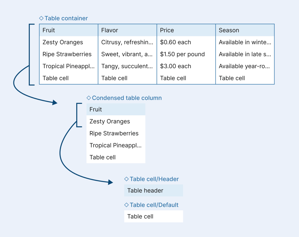
Building blocks in the table rows
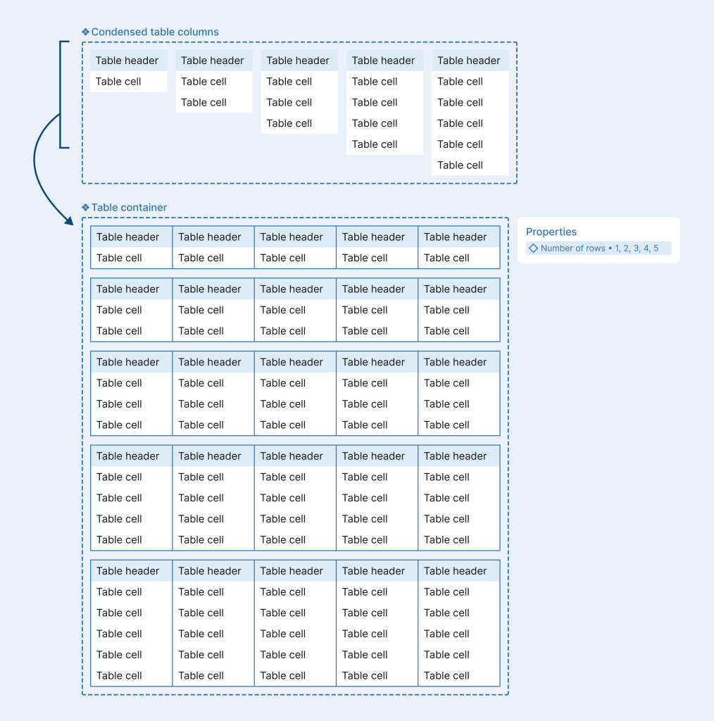
One component, multiple builds
By using Figma variants, you can build table components from the ground up—starting at the smallest units like cells. This keeps the main component clean and easy to use as well as easy to update and maintain.
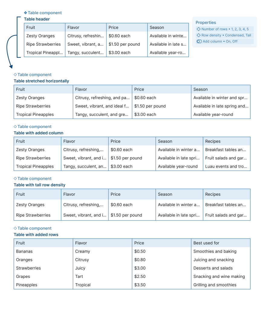
- Auto layout allows tables to automatically stretch to fit any screen size
- Adding in a toggle for additional columns allows users to insert new columns without detaching the component
- Including row density controls at the cell and column level makes it easy to adjust spacing across the entire table directly from the parent component
- Structuring rows at the column level means you can add new rows without needing to go into each column individually—saving time