02.14.25
From layers to logic: Figma component catalog
Overview
Building a design system involves creating a wide range of components – each with it’s own level of complexity. While not all components are structured the same, they are all built on the same foundational principles set in the design system. Some require multiple layers of nested, atomic components while others are more straightforward. Explore the examples to see how each component is thoughtfully constructed.
Featured components
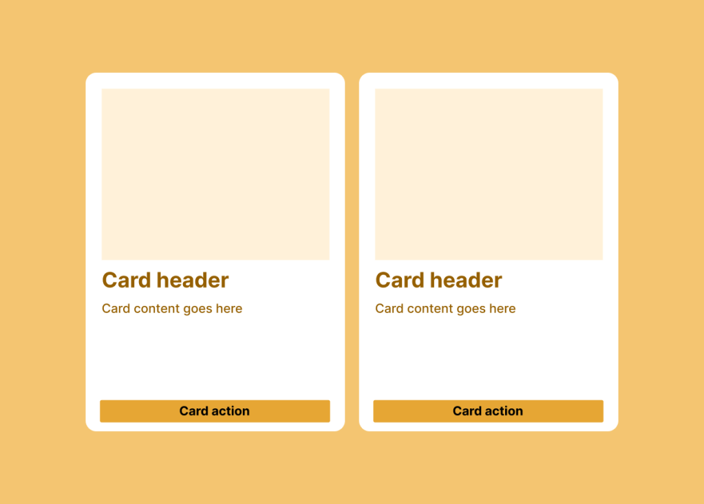
Cards
Card component that contains a combination of content like text, images, buttons or icons. How can we make card components that designers can update the content while having built in auto layout.
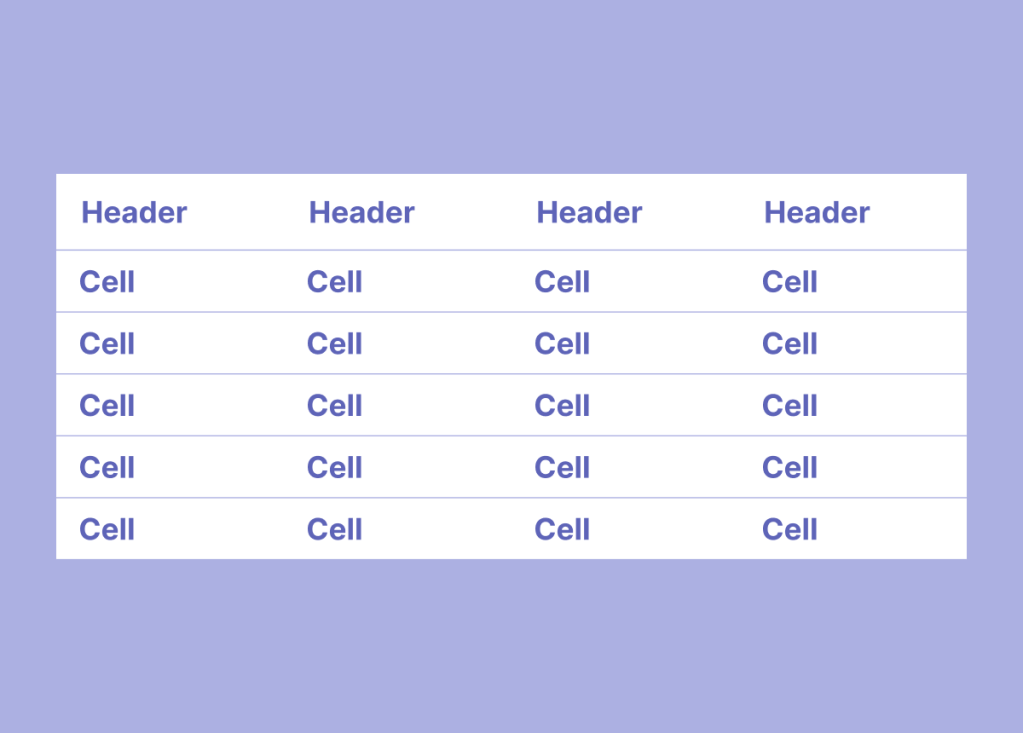
Tables
Used to display structured data in rows and columns, making it easy to scan, compare, and analyze information. How to create a responsive table that allows users to add rows and modify column types
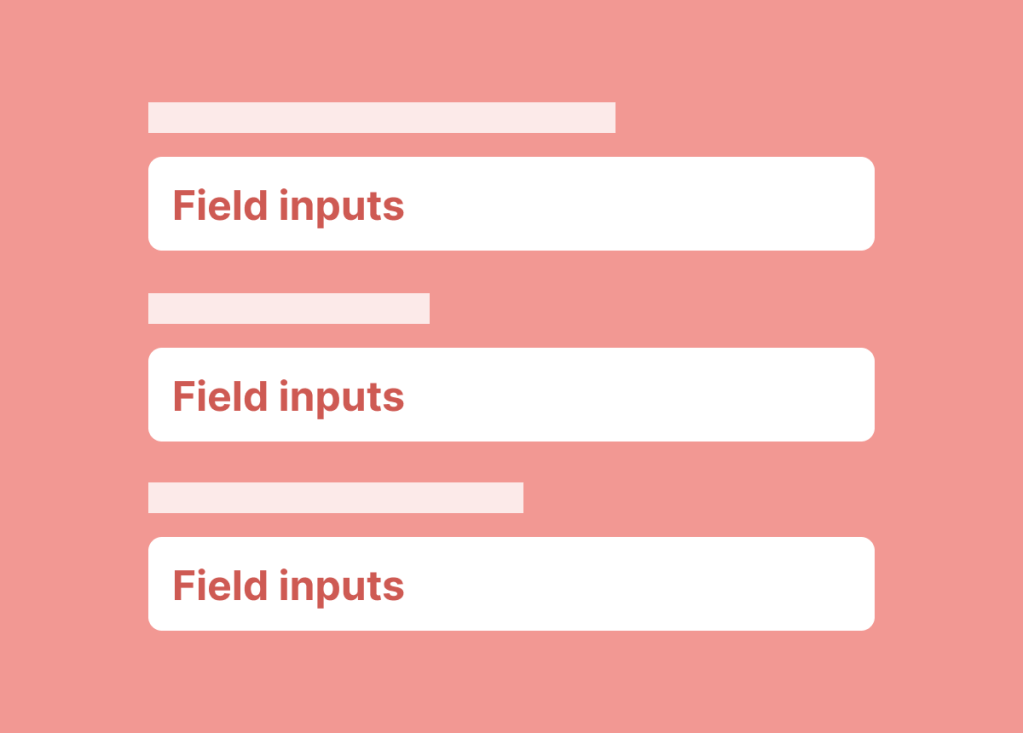
Field inputs
Components used to collect information such as date, time, text, numbers, or selections. How to consolidate the field input variants into a single component.
 amy dai